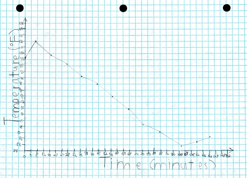

 I created a line graph that summarizes the August 21, 2017 solar eclipse. I used data to create my graph. I studied it because I thought it was interesting and cool. I went to Doko Meadows Park in


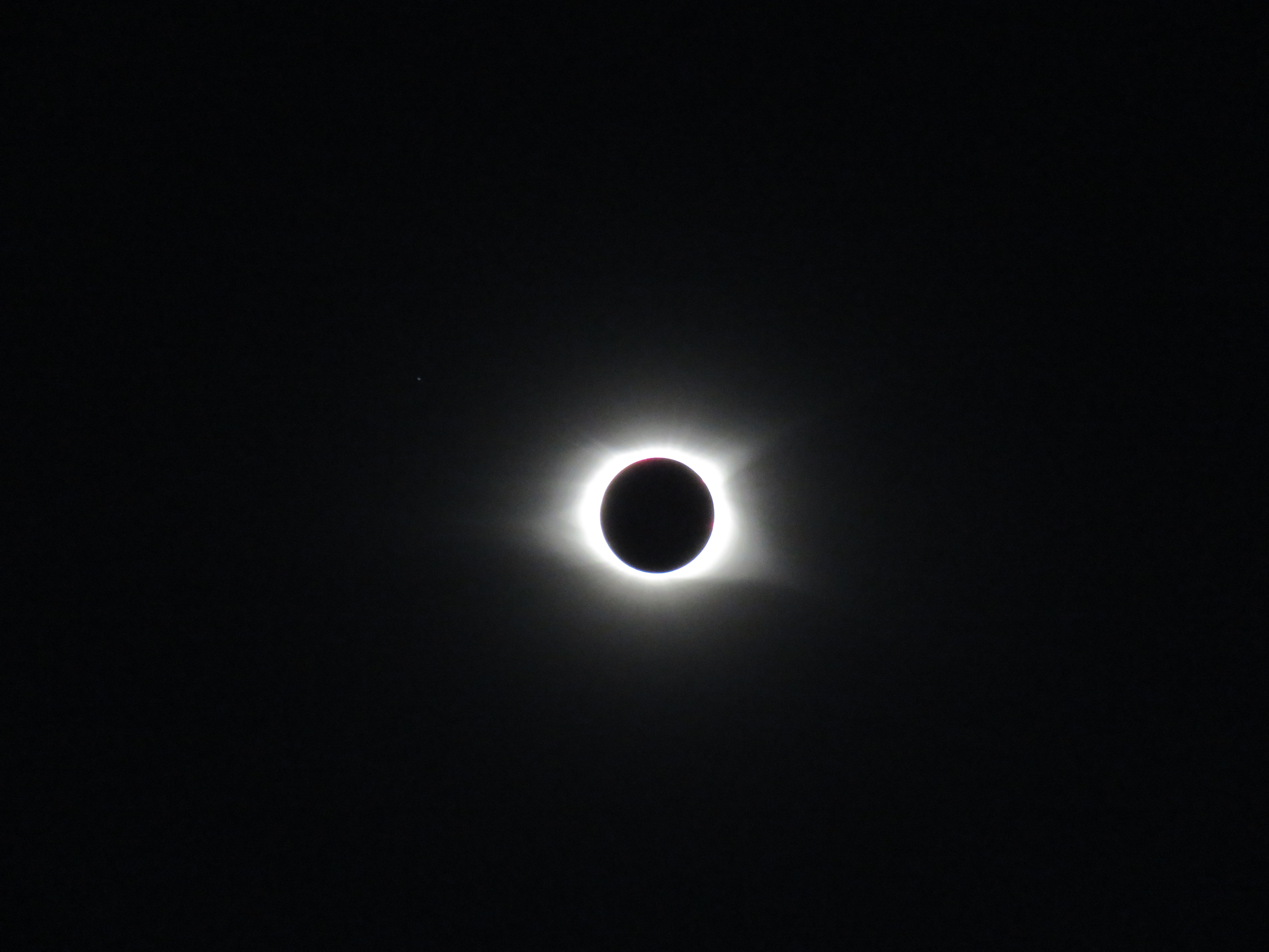
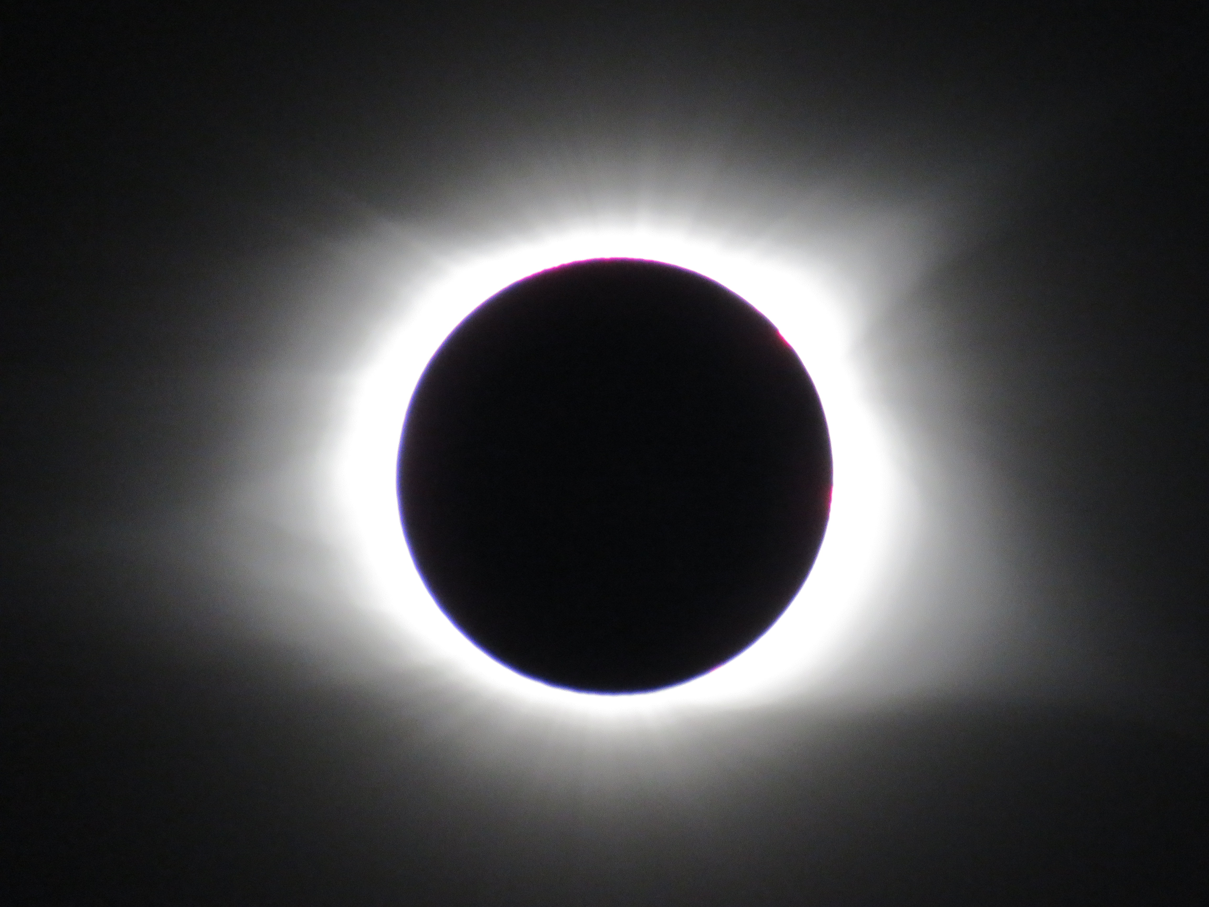


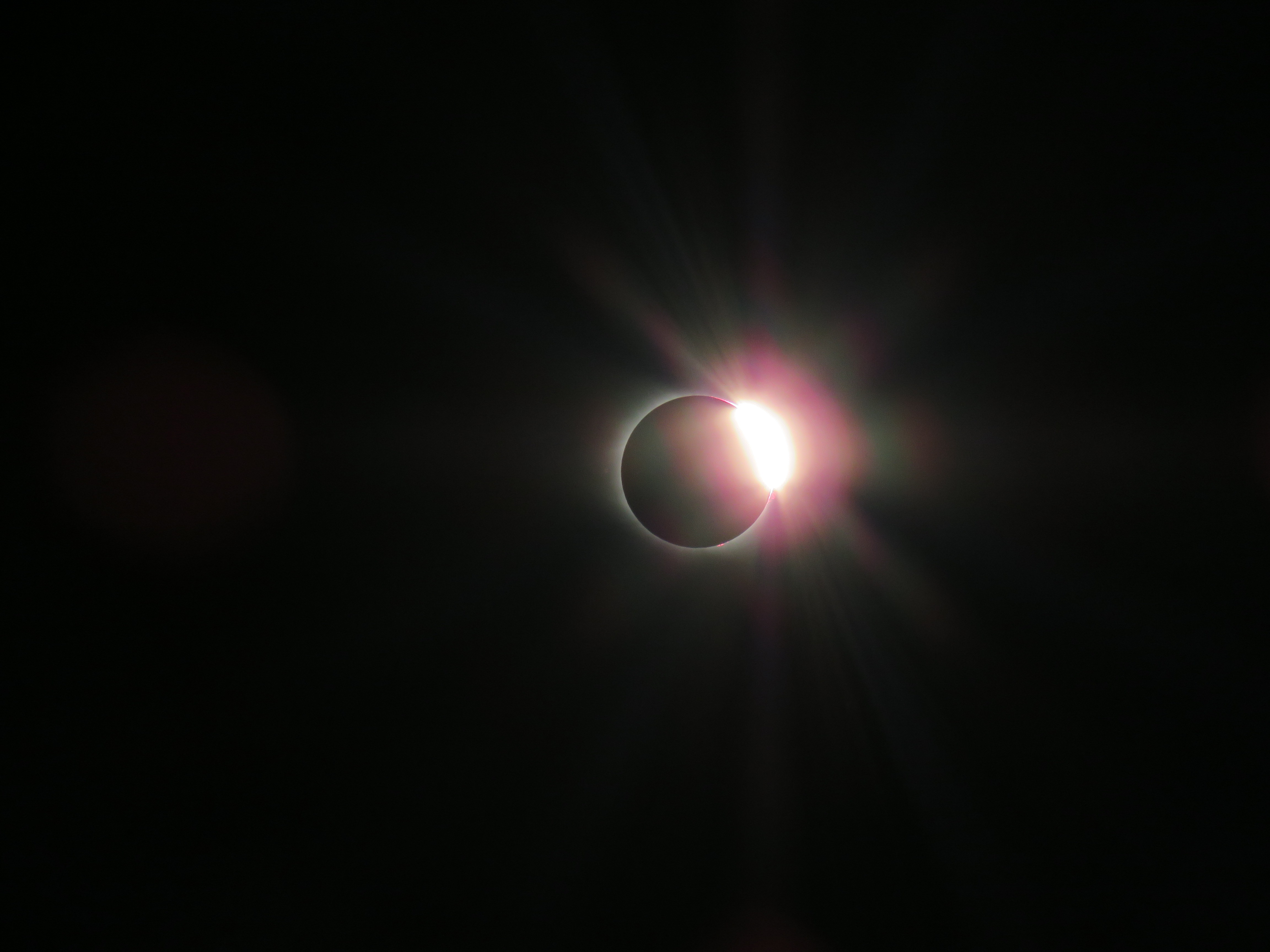
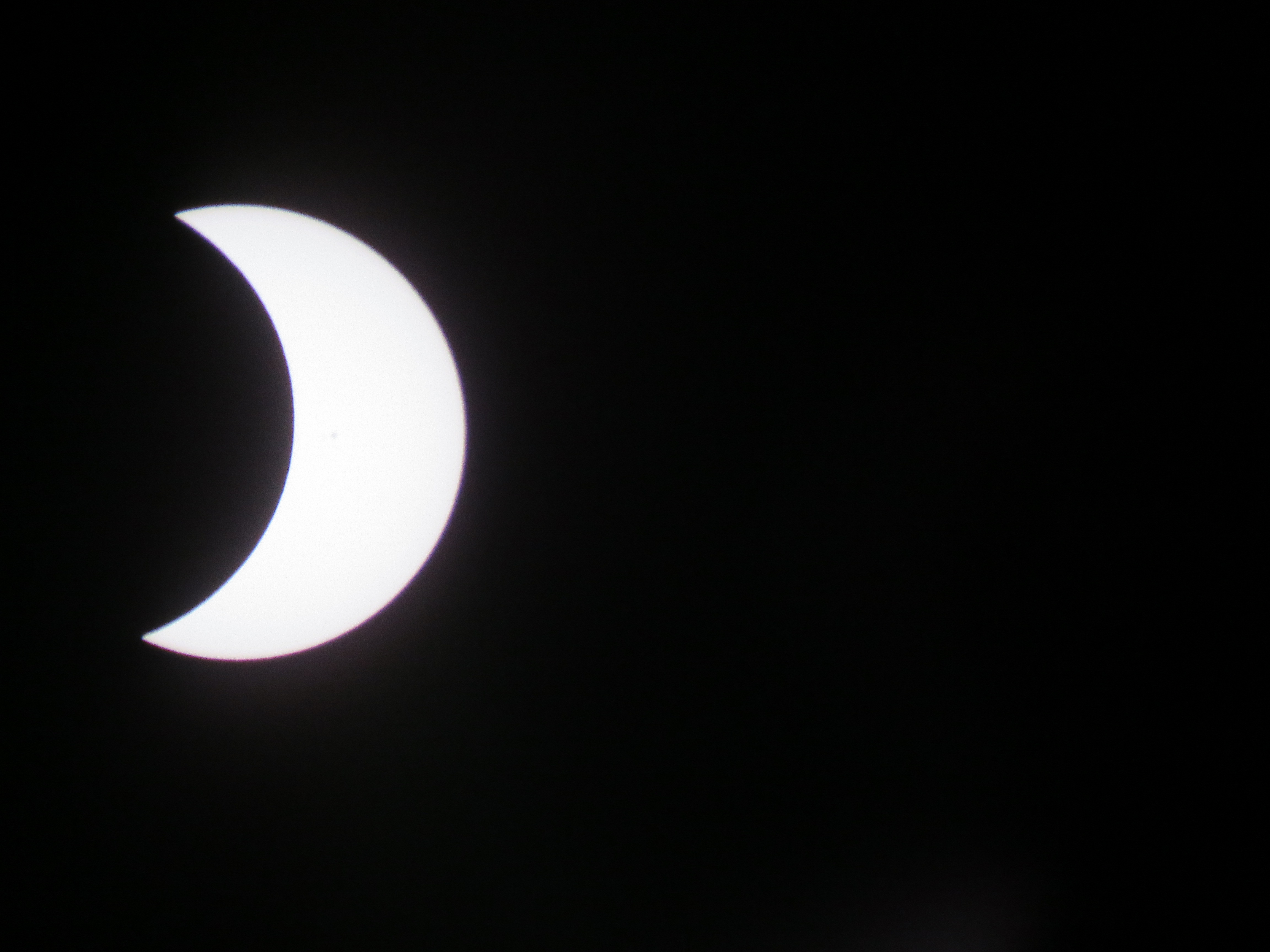
The Solar Eclipse of August 21, 2017
Data Table


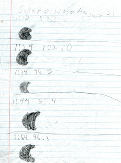
My data table has time and temperature between data points. I brought a weather station to the park to read time and temperature. Time was in units of minutes. I started collecting data at 1:17 in the afternoon. I converted my data to time elapsed to make plotting it easier. For example, I made 1:17 into 0. Temperature was in units of degrees Fahrenheit.
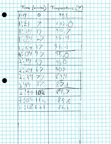
| Time (p.m.) | Time (min.) | Temperature (°F) | |
|---|---|---|---|
| 1:17 | 0 | 99 | .3 |
| 1:24 | 7 | 102 | .0 |
| 1:34 | 17 | 99 | .7 |
| 1:44 | 27 | 98 | .4 |
| 1:54 | 37 | 96 | .3 |
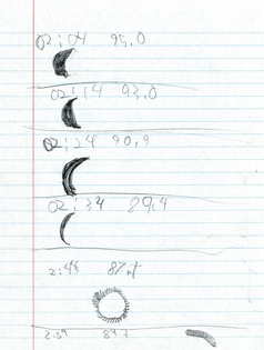
| 2:04 | 47 | 95 | .0 |
| 2:14 | 57 | 93 | .0 |
| 2:24 | 67 | 90 | .9 |
| 2:34 | 77 | 89 | .4 |
| 2:44 | 87 | 87 | .1 |
| 2:59 | 102 | 84 | .7 |
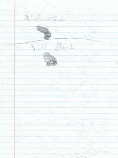
| 3:09 | 112 | 85 | .5 |
| 3:18 | 121 | 86 | .2 |
Line Plot
My graph (line plot) shows how temperature changes with time during the eclipse. Time was on the X axis (left to right) and temperature was on the Y axis (up and down). When the eclipse started the temperature went down; I think this is because the Moon cast a shadow. On the line plot the temperature went down in a straight line. The temperature went down for about 1:30 because the Moon was covering more and more of the Sun. Right after this was totality. After totality the temperature went up again because the Moon was uncovering the Sun.